


The Importance of Form Validation in Angular Web Development
Form validation is a critical aspect of web development, especially when building applications with Angular. It ensures that the user inputs data in a correct format, which helps to prevent errors and improve the overall user experience.
When building forms in Angular, it’s important to provide feedback to the user about any errors in the form. This feedback can be in the form of error messages that appear next to form controls when the user has entered invalid data.
The Advantages of Implementing a Reusable Validation Message Solution
Having a generic solution for showing validation messages is important because it allows developers to write reusable code that can be applied to any form control, instead of having to write separate code for each individual form control. This helps to reduce the amount of code that needs to be written, making the development process more efficient and scalable. A generic solution also makes it easier to maintain and update the codebase, as changes can be made in a single location, rather than having to update multiple components.
Simple form validation
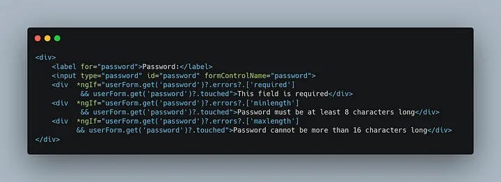
In this section, we’ll take a look at a simple example of a form that requires validation. Let’s say we have a sign-up form that requires users to provide their name, email address, and password. Without a reusable validation component, we would typically add validation to this form in the following way
We begin by declaring a FormGroup using the Reactive Forms approach in Angular (In this example, we are using a standalone component)
In our example, we import the necessary module [ReactiveFormsModule] from @angular/forms then create a FormGroup instance with its controls. The FormGroup is used to group a set of FormControl instances, each one representing a form input.
To create a FormControl, you pass a default value as the first argument and an array of validators as the second argument. The validators are used to validate the input value.
For example, you can use:
Validators.requiredvalidator to make the input requiredValidators.emailto validate the input as an emailor you can create your custom sync or async validator
In the component's template, you bind the inputs to their respective controls using the formControlName directive. To show the error messages, you can use the ngIf directive and access the validity of the controls using the get method of the FormGroup instance.
In the template, we use Angular’s built-in directives to display validation error messages based on the validation rules declared in the component’s TypeScript code. The formControlName directive is used to bind the input element to a form control, while ngIf is used to show or hide the error message based on the validity of the form control.
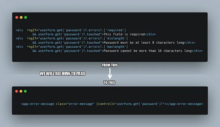
In this code, we’ll look at a common issue in Angular’s Reactive Forms, duplicating validation logic in the template. This approach can lead to repetitive and error-prone code, so we’ll explore a better way to implement form validation in Angular.
this approach can quickly become cumbersome, especially if the form contains many fields. In addition, implementing the validation in the template can make it harder to manage the validation rules and display error messages, as well as increase the risk of errors.
Reusable component validation message
To solve the issue with classic validation, we can centralize the validation logic in a reusable component and reuse it for each form field. This approach makes it easier to manage the validation rules and display error messages, as well as improve code maintainability and reduce the risk of errors.
we begin by creating a standalone component (you can use no standalone component) to handle form validation messages. This component takes a form control as input and displays error messages based on any existing errors in the form control.
- Create a new component ErrorMessage
ng g c error-messages --standalone

CREATE src/app/error-message/error-message.component.scss (0 bytes)
CREATE src/app/error-message/error-message.component.html (28 bytes)
CREATE src/app/error-message/error-message.component.spec.ts (637 bytes)
CREATE src/app/error-message/error-message.component.ts (398 bytes)
- This component requires an input of type AbstractControl to manage validation
- Create a TypeScript file (validators-utils.ts) that includes the list of messages displayed based on the error type and a function to handle it.
stringFormatis a function that takes a string template as its first argument and a list of variable arguments. The function replaces occurrences of{x}in the template with the corresponding argument from the list. If the argument at the specified index is not defined, the original{x}is left in the string.ValidationErrors : Defines the map of errors returned from failed validation checks.
messagesare a constant Map object that maps validator names to their error messages and validator errors key. The error messages can include placeholders in the form of{x}which will be replaced with the corresponding arguments passed tostringFormat.
validatorErrorsKeyis an array of validator errors. These arrays are used to extract the necessary values from thevalidatorErrorsobject to be passed as arguments tostringFormat.
getValidatorErrorMessageis a function that takes two arguments,validatorNameandvalidatorErrors. The function first retrieves the object ({message : string,validatorErrorsKey? : string[]}) associated with the validator name from themessagesmap.Then it retrieves the validator errors values and then uses
stringFormatto format the error message associated with the validator name from themessagesmap. If there are no parameters associated with the validator name, the function simply returns the error message.
For example, if we have a validator Validator.minLength(8) and we don't respect this rule by typing just 5 characters, then:
validatorName = minlength
validatorErrors = {'actualLength':5,'requiredLength':8}
- To integrate the exported function
getValidatorErrorMessageinto theErrorMessageComponentto display error messages. To do this, simply import the function into the component file and then call the function, passing in the necessary parameters such asvalidatorNameandvalidatorErrors. The returned string can then be used as the error message.
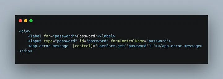
- It’s now the time to use our reusable validation component in our forms, to use our component, we need to import it and simply use it in our template.
- and in the template
Now, we have our reusable component and it’s clearly provides a clean and simple solution for form validation. It eliminates the potential of errors that are often present in traditional validation methods, making it easier for both developers and maintainers to work with it.
Without Reusable Component
With Reusable Component
Reusable component validation message with Angular Material
Now, let’s learn how to integrate our component with Angular Material. We will be using MatFormFieldModule along with mat-error to display messages. The issue with mat-erroris that it must be used directly within mat-form-field.To overcome this, we need to use our reusable component as an attribute, not as an element. This is achieved by using it as an attribute of the mat-error.
- To use a selector as an attribute, we can use brackets
[ ]in the selector declaration
@Component({
  selector: '[app-error-message]',
  standalone: true,
  imports: [CommonModule],
  template: `<ng-container *ngIf="errorMessage !== null">{{errorMessage}}
             </ng-container>`,
})
export class ErrorMessageComponent
- and now we can use our component in
mat-error(dont’t forget to import MatFormFieldModule and MatInputModule)
Summary
In this article, we learned about the advantages of using reusable components for form validation in Angular and how to implement it. This approach leads to more manageable code and reduces the risk of errors by reusing validation logic.
You can find the code here, I am using an application based on standalone components. You can read more about it in this article.
If you have questions or comments, let me know in the comments below.